What’s in a cover?

Prospective readers can, and do, judge a book by its cover. So how does a publisher choose the right cover for a book? Wherever we can, Fremantle Press uses local photographers and we are always on the lookout for more, so do take a look at our guidelines. The cover for Gwen, however, did not need a Western Australian image. Here’s how publisher Georgia Richter chose it.
A book’s cover is the result of many conversations between publisher, sales and marketing. It is the result of what happens when a designer responds to the design brief and returns some (sometimes many) interpretations to the in-house team, where its direction will be refined and honed. Refining the look of the jacket involves further consultation – with the author, with sales reps, with bookshops and, in the case of a children’s book, a group of readers.
We need to successfully make the leap between the imagined reader and real readers, while faithfully representing the contents of the book. Which is the jacket that will catch the eye? Which image will make a browser turn over the book to read the blurb? And which is the blurb that will encourage the browser to open the book, and start to read? That is the cover we are looking for. If the author also falls in love with the cover, then that is ideal too.
Goldie Goldbloom’s third book, Gwen, is a work of historical fiction about the real-life artist Gwen John, who lived a bohemian life in Paris at the turn of the twentieth century, and who was lover and muse for the sculptor Rodin. Unusually, it was Goldie Goldbloom herself who found the image that our designer Nada Backovic used. A fascination with the actor Tilda Swinton led Goldbloom to a picture by photographer Katia Chausheva. The young woman in the photograph had the perfect expression of strength and wistful vulnerability for the Gwen of Goldie’s story.
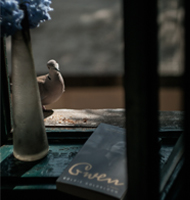
I recently mailed a copy of Gwen to the photographer in Bulgaria. Katia wrote back that Gwen had arrived just in time to be a birthday present to her daughter, the young woman in the photograph. Katia told me that her daughter Nadia is her best model, and her biggest inspiration: ‘Every session with her is a journey into the unknown and unconscious for both of us,’ she wrote. And she sent me a photo of the book on her windowsill.
International collaborations can sometimes have an unexpected intimacy. We seek the images that best tell our stories. It is lovely to be reminded that behind every one of those images is a story of the photographer’s own.
Photo by Katia Chausheva.


